Category
Category
Application Design
Application Design
Sector
Sector
Internet Service Provider
Internet Service Provider
Completion Date
Completion Date
Oct 21, 2024
Oct 21, 2024
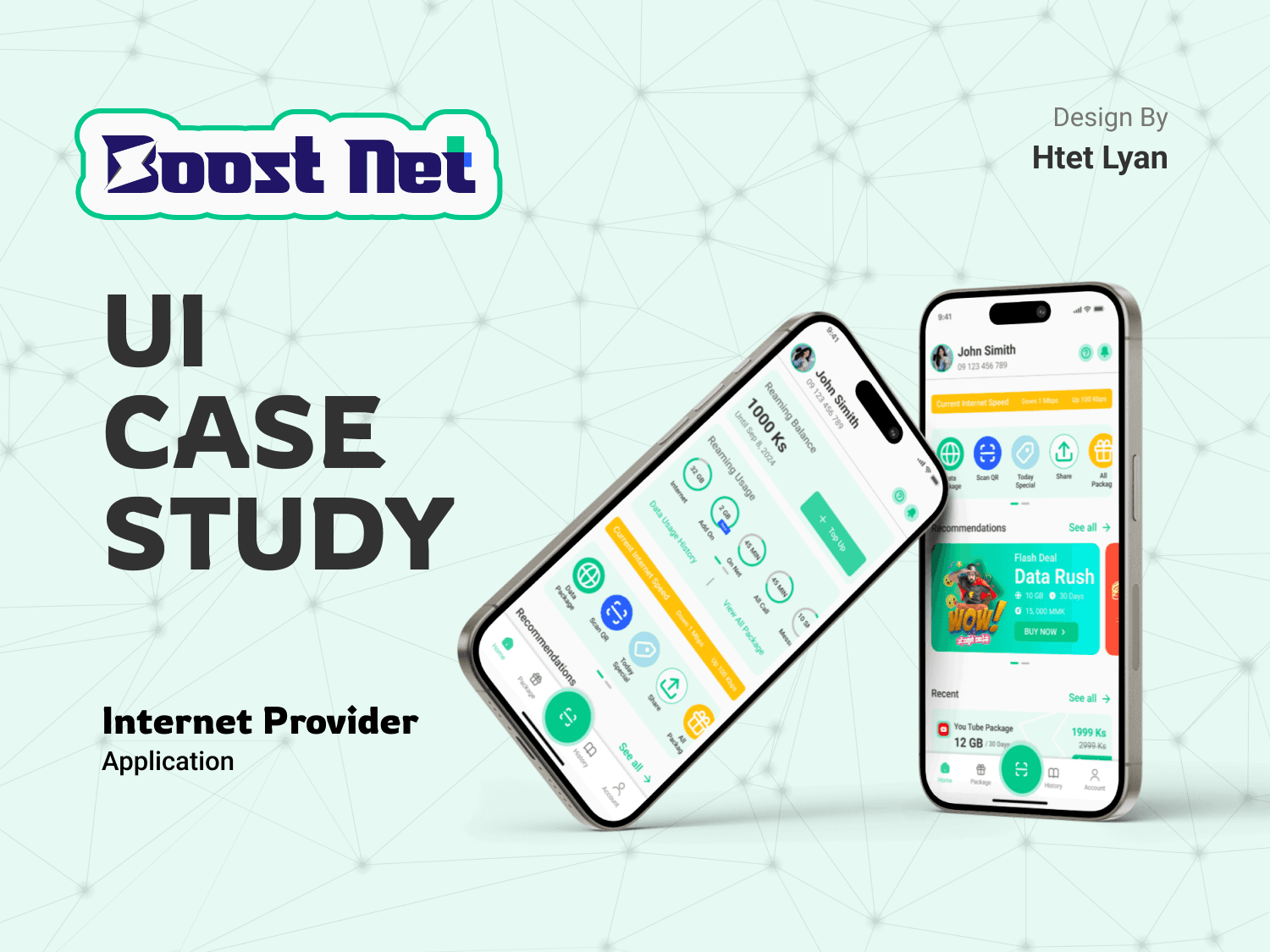
Let's me present Boost Net, a modern and user-friendly app concept for internet service providers. This UI design focuses on delivering a seamless, visually appealing, and intuitive experience inspired by local service provider apps like Ooredoo, Atom, and MPT.
Project Overview
This app is designed with the primary goal of simplifying how users interact with their internet service provider. The app enables users to:
Easily track remaining balance, data, and voice packs.
Access detailed usage history for data and calls.
Discover and purchase new plans and offers.
Manage account settings effortlessly.
The design process emphasizes functionality, accessibility, and an aesthetic that aligns with the expectations of modern users.
Key Features
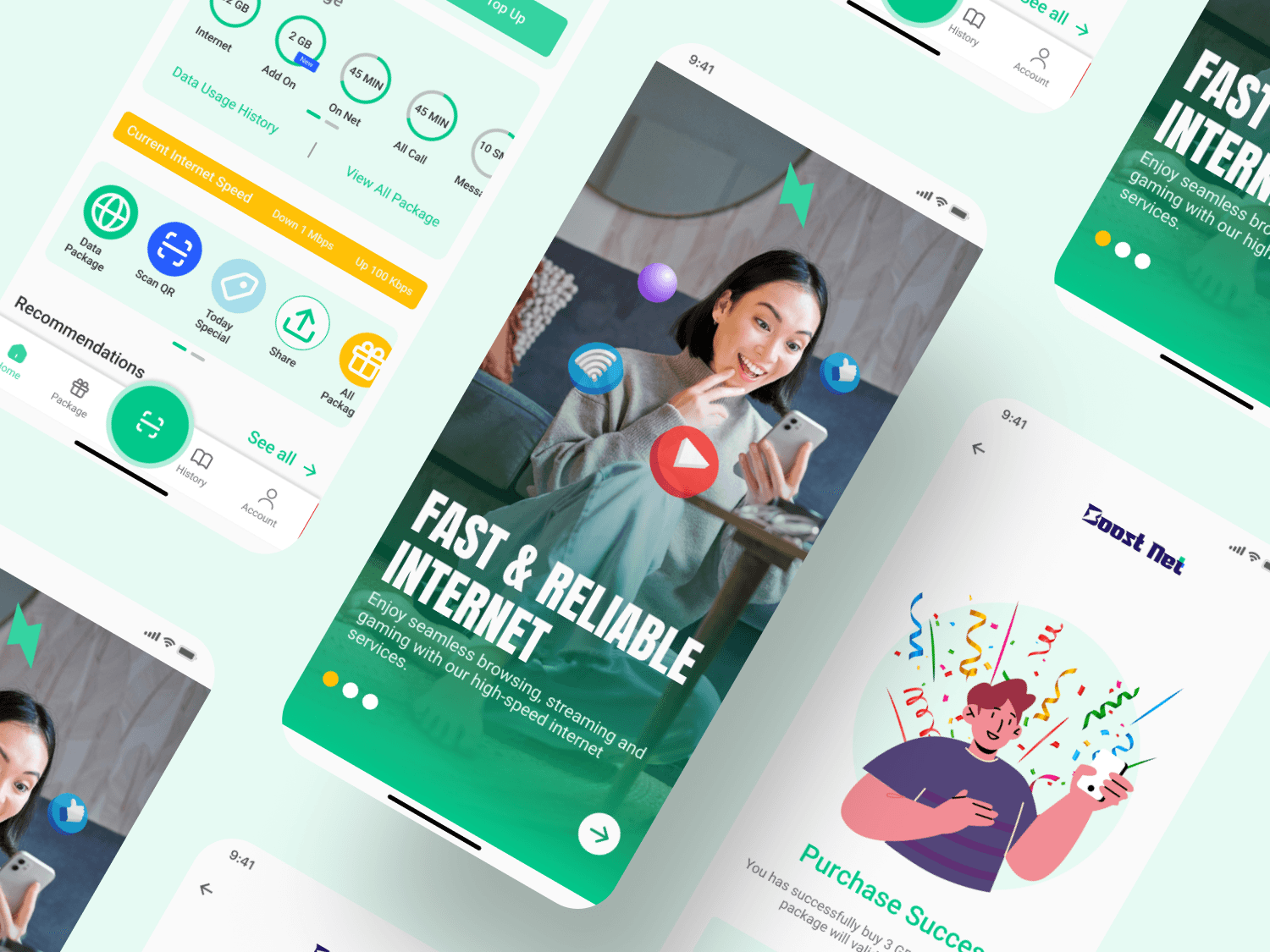
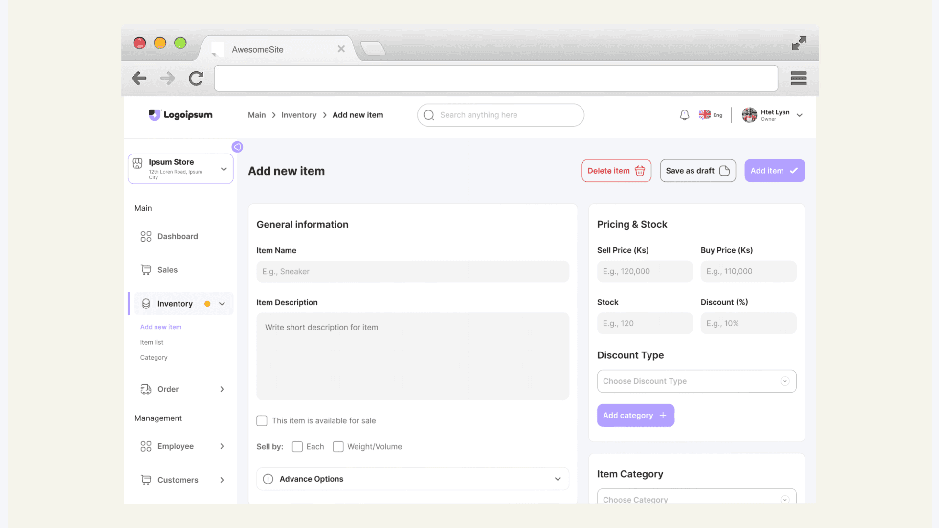
Dashboard:
A clean and minimal dashboard displaying balance, data, and voice pack status at a glance.
Interactive progress bars for quick visualization of data and balance usage.
Quick-access buttons for top-ups and plan renewals.
Usage History:
A dedicated section showing detailed usage history for data, calls, and SMS.
Filters for sorting by daily, weekly, or monthly usage.
Plan and Offers:
Explore curated offers and packages with detailed descriptions and pricing.
One-tap purchase for added convenience.
Other Features:
Notifications: Alerts for expiring plans and new offers.
Support Section: In-app live chat and FAQs for customer support.
Let's me present Boost Net, a modern and user-friendly app concept for internet service providers. This UI design focuses on delivering a seamless, visually appealing, and intuitive experience inspired by local service provider apps like Ooredoo, Atom, and MPT.
Project Overview
This app is designed with the primary goal of simplifying how users interact with their internet service provider. The app enables users to:
Easily track remaining balance, data, and voice packs.
Access detailed usage history for data and calls.
Discover and purchase new plans and offers.
Manage account settings effortlessly.
The design process emphasizes functionality, accessibility, and an aesthetic that aligns with the expectations of modern users.
Key Features
Dashboard:
A clean and minimal dashboard displaying balance, data, and voice pack status at a glance.
Interactive progress bars for quick visualization of data and balance usage.
Quick-access buttons for top-ups and plan renewals.
Usage History:
A dedicated section showing detailed usage history for data, calls, and SMS.
Filters for sorting by daily, weekly, or monthly usage.
Plan and Offers:
Explore curated offers and packages with detailed descriptions and pricing.
One-tap purchase for added convenience.
Other Features:
Notifications: Alerts for expiring plans and new offers.
Support Section: In-app live chat and FAQs for customer support.
Design Process
I utilized the following techniques to create a polished and efficient design:
Auto Layout:
Ensured a responsive and scalable design by structuring all components using Auto Layout.
Created adaptive layouts for seamless transitions between mobile and tablet screens.
Nested Components:
Built reusable and nested components for buttons, cards, and navigation elements, ensuring consistency and efficiency.
Updated components globally for streamlined iteration and design changes.
Interactive Prototypes:
Developed clickable prototypes to demonstrate user flows for tracking balance, viewing history, and purchasing plans.
Advanced Styles and Tokens:
Defined color styles, typography tokens, and spacing guidelines for a cohesive design system.
Visual Aesthetics
The visual design of Boost Net balances minimalism with realism, creating a professional yet approachable interface:
Clean Layout: Minimalistic layouts with ample white space to enhance readability and focus.
Modern Font: Used sleek and professional fonts like Poppins or Roboto for a contemporary look.
Color Scheme: A light and vibrant palette with subtle gradients, ensuring clarity and accessibility.
Interactive Elements: Soft shadows and smooth hover effects for buttons and cards, adding a tactile feel.
Realistic Mockups: Presented designs in context, using realistic device mockups to showcase the user experience.
Outcome
The result is a sleek, functional, and user-friendly app concept that caters to the needs of modern internet users. The design demonstrates how thoughtful UI design can enhance user engagement and satisfaction while maintaining a visually striking appearance.
Explore this project further to see the details of the design process and interactive prototypes. Your feedback is highly appreciated!
This content emphasizes your expertise, highlights Figma’s advanced features, and presents a professional tone fitting for your portfolio.

Due to limited resources on Framer, I’ve shared a complete project presentation on Behance. Please follow the link below to explore my comprehensive design process, key decisions, and how I addressed user needs in this case study.
I’d love to hear your honest feedback and suggestions. Your insights are valuable in refining this feature and making it even better!
Lets work together
Lets work together
Lets work together
Htet Lyan
UI/UX Designer | Web Designer | Framer | Webflow
Social


© 2024 Htet Lyan. All rights reserved.