Category
Category
Website Design
Website Design
Sector
Sector
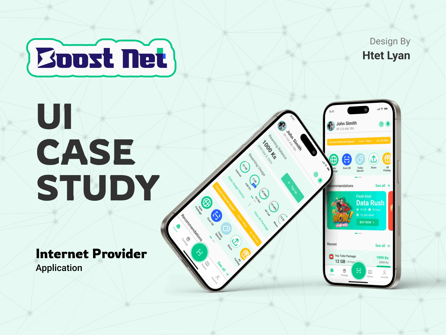
POS | Admin Dashboard | UI/UX Design | Prototype
POS | Admin Dashboard | UI/UX Design | Prototype
Completion Date
Completion Date
Jan 3, 2025
Jan 3, 2025
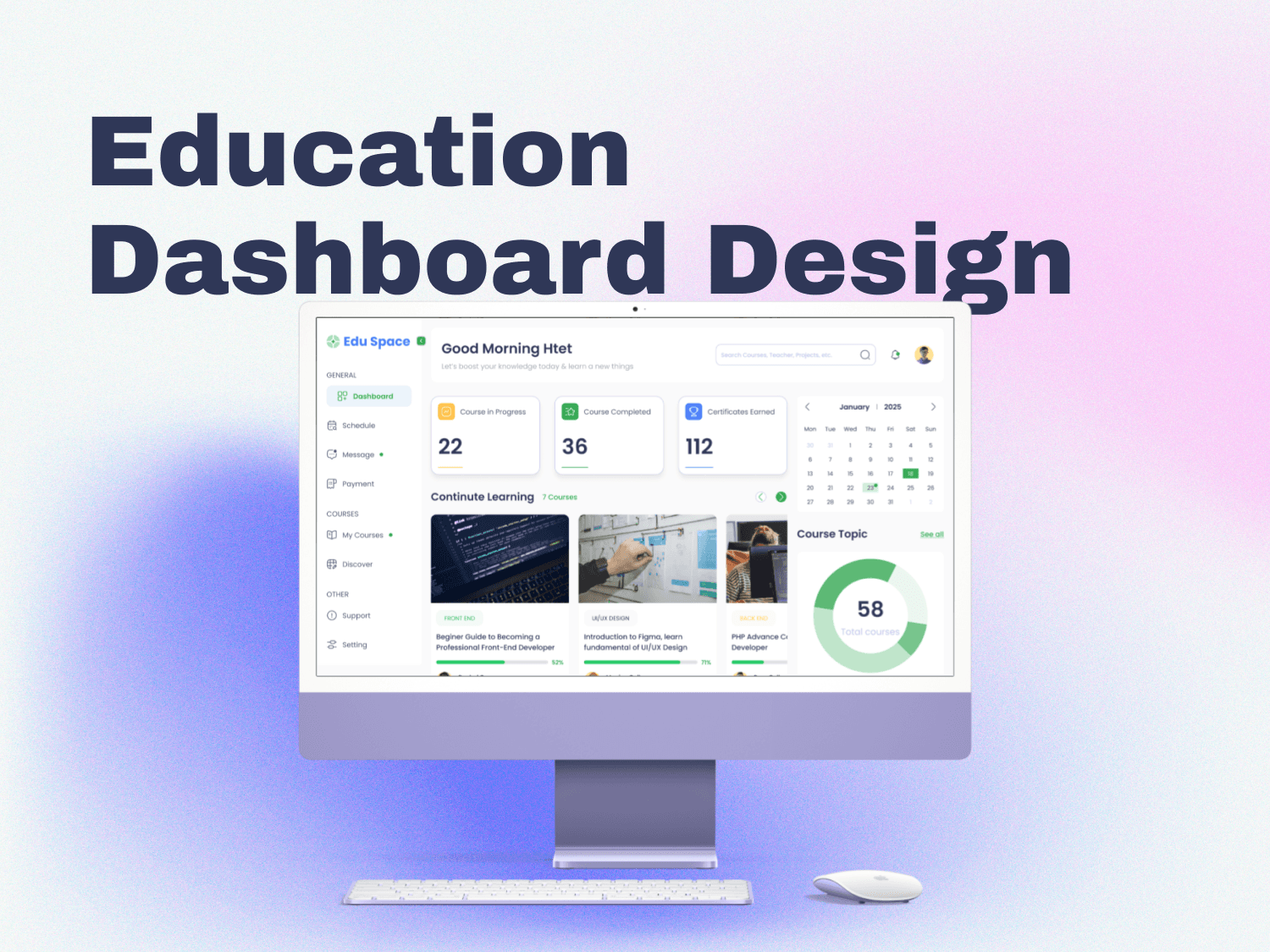
Project Overview
This project involved designing an Admin Dashboard with a focus on usability and functionality. The assignment required creating at least three key pages:
Dashboard
Sales Table
Create Sales
Products
Additionally, the task emphasized meaningful charts, tables, filters, logical workflows, and the selection of suitable colors and fonts. As a bonus, a working prototype in Figma was also included.
Objective
The goal was to create an intuitive and visually appealing admin dashboard that simplifies complex data management tasks for users, focusing on efficient navigation, data visualization, and key administrative actions.
Design Process
Inspiration
Researched live POS dashboards like Loyverse to understand practical user interfaces.
Analyzed design patterns and features that align with user needs in admin dashboards.
Ideation
Used card sorting to determine essential features and organize them logically.
Key considerations included:
Clear navigation.
Critical data points like sales, inventory, and notifications.
Visual data representation through charts and tables.
User-friendly action buttons for quick management tasks.
Design Execution
Divided the Figma file into four structured pages:
Design Process: Documenting the steps and decisions taken during the design.
All Components: Reusable design elements for consistency across the dashboard.
Presentation for Each Page: Detailed designs of the required pages.
Prototype: A working prototype showcasing user interactions.
Focus Areas in Design
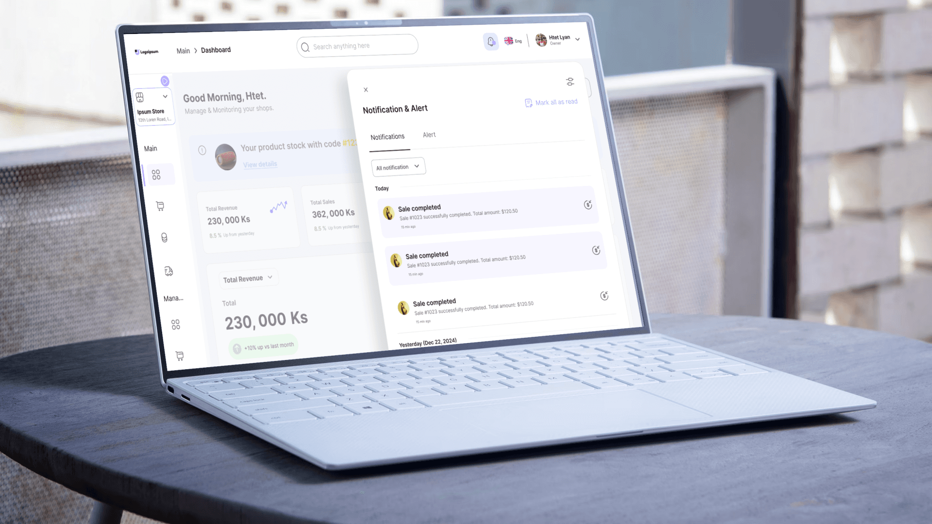
Dashboard Page: Displayed an overview with key metrics, charts, and alerts.
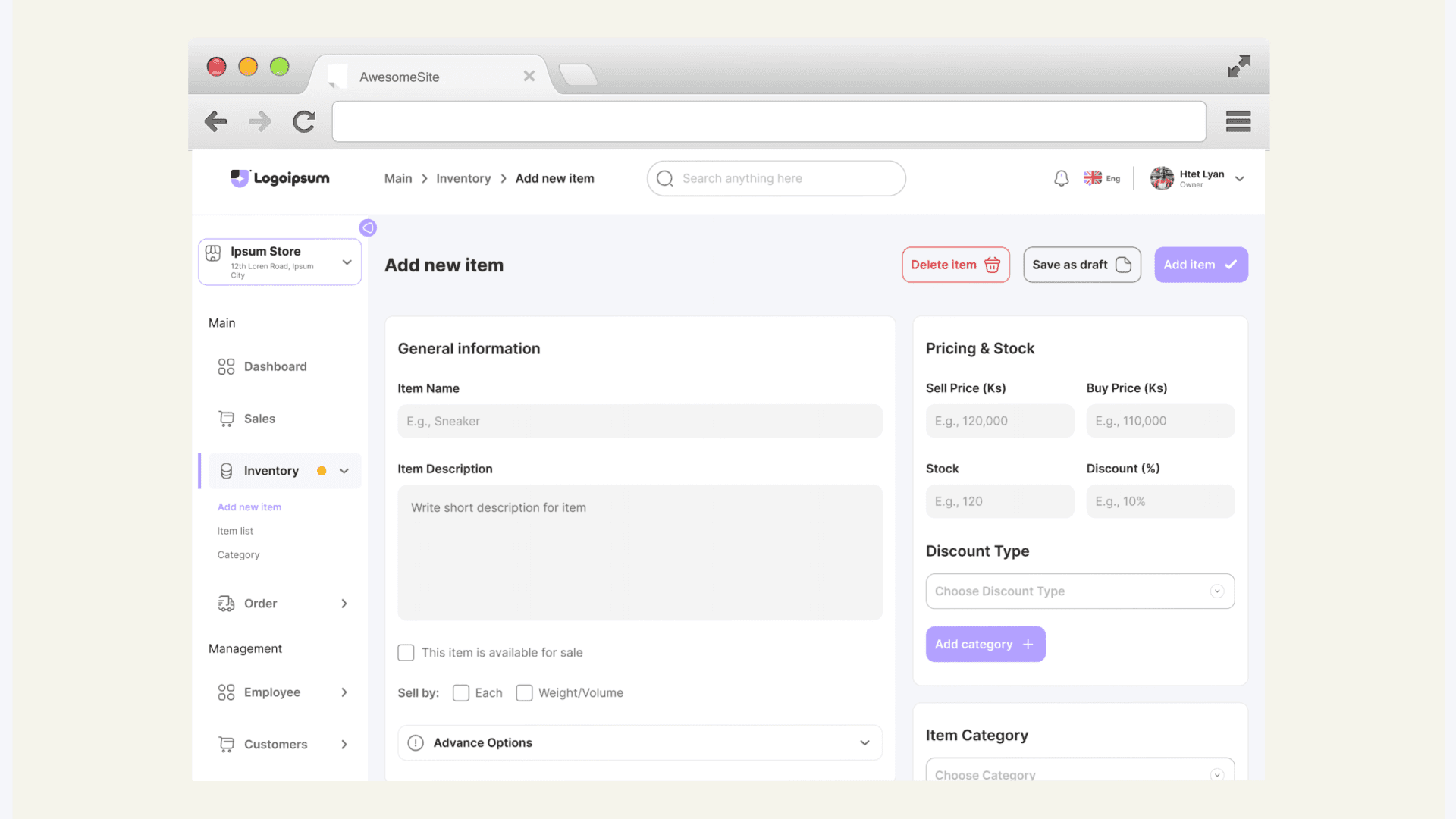
Add Item to Store Page (instead of Sales Page):
Included fields for item details, price, stock, and category.
Provided quick actions like Add Item, Save as Draft, and Cancel.
Products Page: Showcased inventory management with table filters, quick actions, and pagination.
Design Highlights
Color Palette:
Primary: #A4F5A6 for a refreshing and calm look.
Secondary: #B3A1FF for contrast and focus.
Advantage: Enhances readability and maintains a professional yet approachable feel.
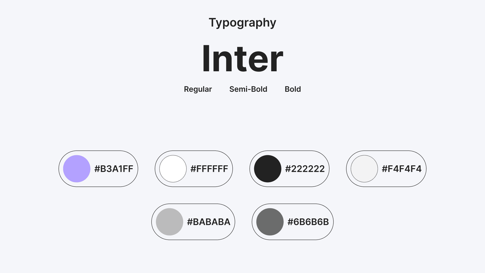
Typography:
Font: Inter, chosen for its multiple font weights and modern appearance.
Advantage: Ensures clear hierarchy and excellent readability.
Prototype:
Basic animations to demonstrate interactions, such as adding an item to the store.
Focused on simplicity due to beginner-level motion design skills.
Key Takeaways
This assignment provided valuable experience in:
Designing functional and user-centered admin dashboards.
Creating cohesive design systems using reusable components.
Understanding the importance of clear navigation and logical workflows.
Prototyping and presenting designs effectively.
Design Process
Inspiration
Researched live POS dashboards like Loyverse to understand practical user interfaces.
Analyzed design patterns and features that align with user needs in admin dashboards.
Ideation
Used card sorting to determine essential features and organize them logically.
Key considerations included:
Clear navigation.
Critical data points like sales, inventory, and notifications.
Visual data representation through charts and tables.
User-friendly action buttons for quick management tasks.
Design Execution
Divided the Figma file into four structured pages:
Design Process: Documenting the steps and decisions taken during the design.
All Components: Reusable design elements for consistency across the dashboard.
Presentation for Each Page: Detailed designs of the required pages.
Prototype: A working prototype showcasing user interactions.
Focus Areas in Design
Dashboard Page: Displayed an overview with key metrics, charts, and alerts.
Add Item to Store Page (instead of Sales Page):
Included fields for item details, price, stock, and category.
Provided quick actions like Add Item, Save as Draft, and Cancel.
Products Page: Showcased inventory management with table filters, quick actions, and pagination.
Design Highlights
Color Palette:
Primary: #A4F5A6 for a refreshing and calm look.
Secondary: #B3A1FF for contrast and focus.
Advantage: Enhances readability and maintains a professional yet approachable feel.
Typography:
Font: Inter, chosen for its multiple font weights and modern appearance.
Advantage: Ensures clear hierarchy and excellent readability.
Prototype:
Basic animations to demonstrate interactions, such as adding an item to the store.
Focused on simplicity due to beginner-level motion design skills.
Key Takeaways
This assignment provided valuable experience in:
Designing functional and user-centered admin dashboards.
Creating cohesive design systems using reusable components.
Understanding the importance of clear navigation and logical workflows.
Prototyping and presenting designs effectively.
Due to limited resources on Framer, I’ve shared a complete project presentation on Behance. Please follow the link below to explore my comprehensive design process, key decisions, and how I addressed user needs in this case study.
I’d love to hear your honest feedback and suggestions. Your insights are valuable in refining this feature and making it even better!
Lets work together
Lets work together
Lets work together
Htet Lyan
UI/UX Designer | Web Designer | Framer | Webflow
Social


© 2024 Htet Lyan. All rights reserved.