Category
Category
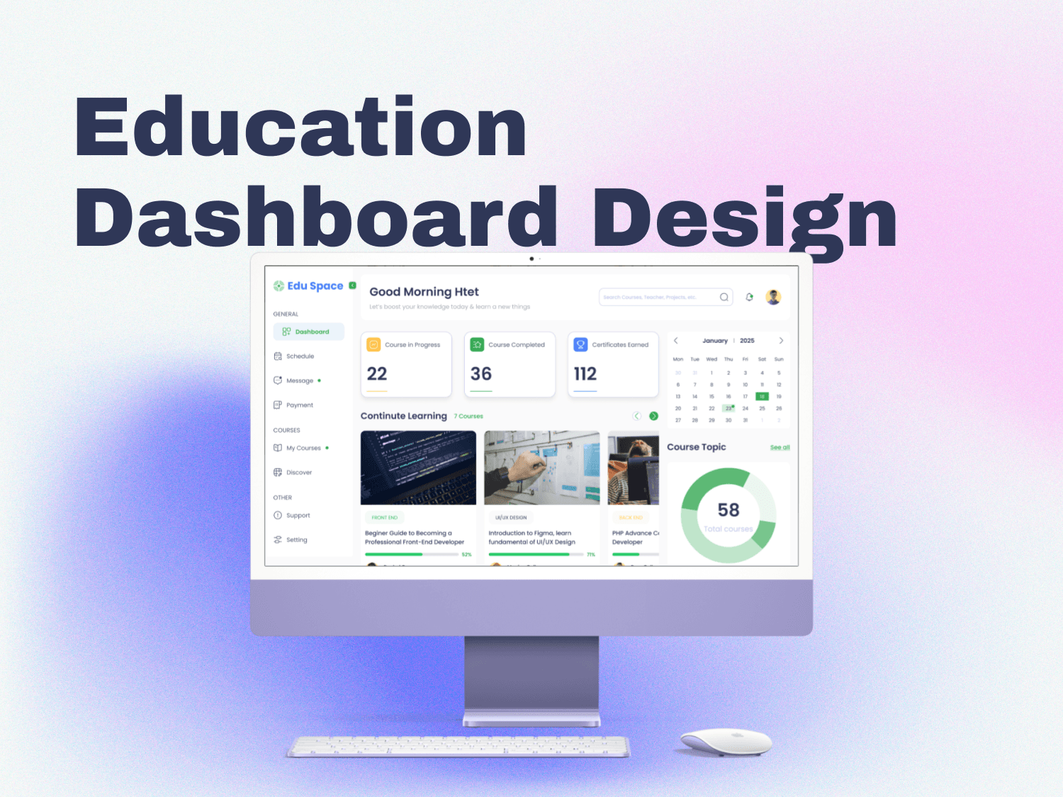
Application Design
Application Design
Sector
Sector
Video Editor
Video Editor
Completion Date
Completion Date
May 6, 2024
May 6, 2024
Project Overview
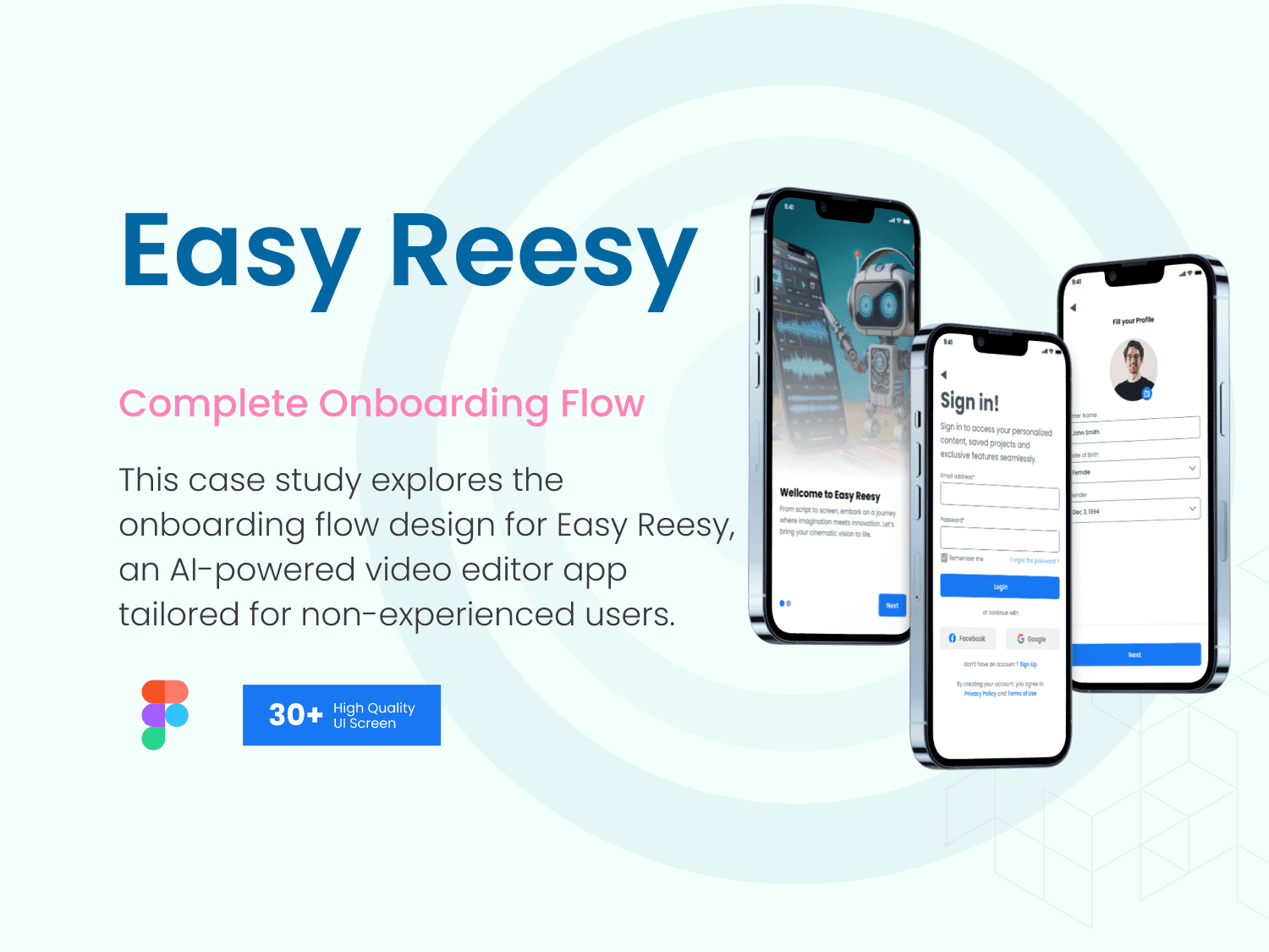
Easy Reesy empowers users with little to no editing experience to create polished videos or short reels. Leveraging AI, the app simplifies complex editing tasks, offering an intuitive and approachable experience.
The focus of this case study is on the onboarding flow—the critical first interaction that ensures users can quickly understand the app’s features, feel confident in navigating its tools, and start creating engaging content effortlessly.
UX Design Process
1. Empathize
To understand the needs and pain points of potential users:
User Research: Conducted surveys and interviews with non-professional video editors to identify challenges they face with traditional tools.
Key insights: Users felt overwhelmed by advanced features, struggled with terminology, and desired automation for repetitive tasks.
2. Define
Problem Statement: Users need a simplified onboarding experience that introduces the app’s features in a clear and engaging way without overwhelming them.
Goal: Create an onboarding flow that guides users step-by-step, highlights core features like AI-assisted editing, and encourages first-time content creation.
3. Ideate
Brainstormed onboarding methods, such as interactive tutorials, tooltips, and guided walkthroughs.
Explored gamification elements to make the process more engaging.
4. Prototype
Developed wireframes for onboarding screens, focusing on clarity and ease of navigation.
Iterated based on user feedback from usability tests.
5. Test and Understand
Conducted usability testing with prototypes, refining user flows to reduce friction and ensure users could complete tasks without confusion.
Focused on measurable outcomes: successful onboarding completion and time to first content creation.
UX Deliverables
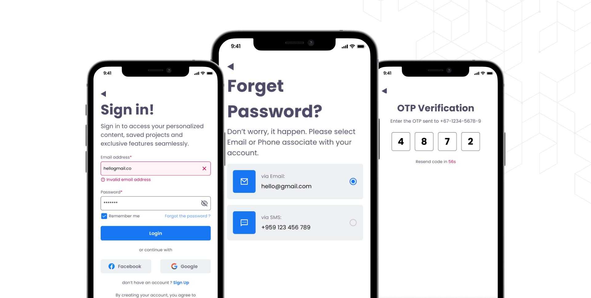
1. Information Architecture
Designed a streamlined structure for the onboarding flow:
Welcome Screen: Brief introduction to the app.
Feature Highlights: Showcase key AI-powered tools with concise descriptions.
Guided Setup: Help users set preferences and understand editing options.
First Project: Offer a simple, guided project to help users start editing immediately.
2. User Flow
Created a detailed flowchart mapping the user’s journey from app installation to completing their first project.
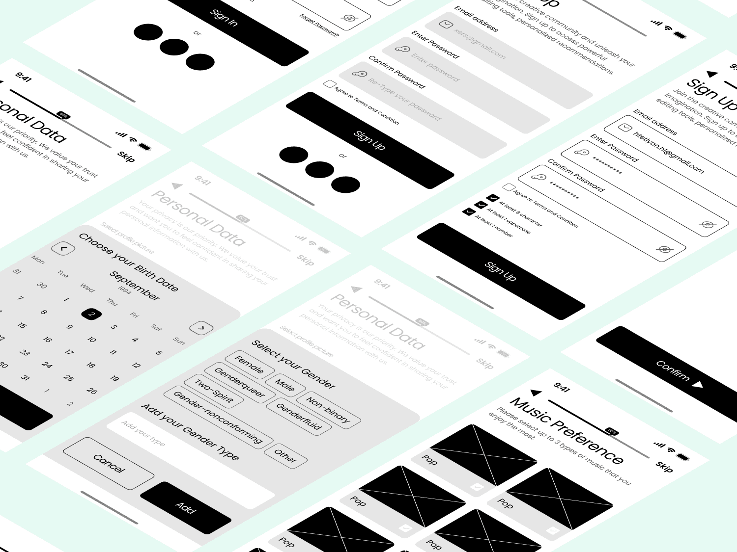
3. Wireframes
Lo-Fi: Focused on layout and content placement.
Mid-Fi: Added interactivity and basic visual elements.
High-Fi: Polished visuals with color, typography, and final UI components.
Project Overview
Easy Reesy empowers users with little to no editing experience to create polished videos or short reels. Leveraging AI, the app simplifies complex editing tasks, offering an intuitive and approachable experience.
The focus of this case study is on the onboarding flow—the critical first interaction that ensures users can quickly understand the app’s features, feel confident in navigating its tools, and start creating engaging content effortlessly.
UX Design Process
1. Empathize
To understand the needs and pain points of potential users:
User Research: Conducted surveys and interviews with non-professional video editors to identify challenges they face with traditional tools.
Key insights: Users felt overwhelmed by advanced features, struggled with terminology, and desired automation for repetitive tasks.
2. Define
Problem Statement: Users need a simplified onboarding experience that introduces the app’s features in a clear and engaging way without overwhelming them.
Goal: Create an onboarding flow that guides users step-by-step, highlights core features like AI-assisted editing, and encourages first-time content creation.
3. Ideate
Brainstormed onboarding methods, such as interactive tutorials, tooltips, and guided walkthroughs.
Explored gamification elements to make the process more engaging.
4. Prototype
Developed wireframes for onboarding screens, focusing on clarity and ease of navigation.
Iterated based on user feedback from usability tests.
5. Test and Understand
Conducted usability testing with prototypes, refining user flows to reduce friction and ensure users could complete tasks without confusion.
Focused on measurable outcomes: successful onboarding completion and time to first content creation.
UX Deliverables
1. Information Architecture
Designed a streamlined structure for the onboarding flow:
Welcome Screen: Brief introduction to the app.
Feature Highlights: Showcase key AI-powered tools with concise descriptions.
Guided Setup: Help users set preferences and understand editing options.
First Project: Offer a simple, guided project to help users start editing immediately.
2. User Flow
Created a detailed flowchart mapping the user’s journey from app installation to completing their first project.
3. Wireframes
Lo-Fi: Focused on layout and content placement.
Mid-Fi: Added interactivity and basic visual elements.
High-Fi: Polished visuals with color, typography, and final UI components.
UI Design Process
As an advanced Figma designer, I utilized modern techniques to create a seamless and visually appealing UI:
1. Auto Layout:
Ensured components were responsive across screen sizes, improving scalability.
2. Nested Components:
Designed reusable, nested components for buttons, tooltips, and onboarding cards.
Centralized updates for efficient iteration.
3. Interactive Prototypes:
Created clickable prototypes to demonstrate animations, tooltips, and transitions.
Incorporated micro-interactions to guide users and enhance usability.
4. Design System:
Established a cohesive design system with typography, color styles, and icon sets.
Used a vibrant yet calming color palette to maintain focus and reduce cognitive load.
Visual Aesthetics
The UI design reflects the app’s core values of simplicity and innovation:
Minimalistic Layouts: Clean interfaces with clear call-to-actions.
Modern Typography: Used Poppins for headings and Roboto for body text to ensure readability.
Color Palette: A vibrant yet professional scheme combining soft gradients and dynamic accent colors.
Interactive Elements: Subtle hover effects and animations to create a dynamic, engaging user experience.
Outcome
The onboarding flow for Easy Reesy achieves the following:
Simplifies the learning curve for new users, empowering them to create their first project with confidence.
Showcases the app’s AI features in an engaging and accessible manner.
Sets the foundation for a positive user experience, increasing overall satisfaction and retention.
Explore this case study further to view detailed designs, user flows, and interactive prototypes. Your feedback is invaluable in refining this experience!
Due to limited resources on Framer, I’ve shared a complete project presentation on Behance. Please follow the link below to explore my comprehensive design process, key decisions, and how I addressed user needs in this case study.
I’d love to hear your honest feedback and suggestions. Your insights are valuable in refining this feature and making it even better!
Lets work together
Lets work together
Lets work together
Htet Lyan
UI/UX Designer | Web Designer | Framer | Webflow
Social


© 2024 Htet Lyan. All rights reserved.